
-
Get Started
-
New Features
-
FAQ
-
HOW-TO
- Technology Partners
- API
- Reports
- YouLi Plan Add-ons
- Affiliates
- Payments
- Video Tutorials
- Website Integration
- Mobile App
- Account Roles
- Tasks
- Packages
- Highlights, Itinerary & Optional Add-ons
- Invitation Groups
- Coupons
- Trip Page Menu
- Integrating Cruise Deck Plans
- Managing Trip Dashboard
- Emails
- Bookings
- Managing People
- Registration
- PDF Confirmation
- Documents
- Billing
-
For Travelers
-
Uncategorized
-
Partners
-
YouLi User Roles
-
Upcoming Features
Why does my Trip Page look different on different screens?
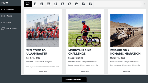
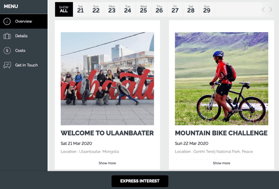
Uplift your travelers' experience with dynamic and mobile responsive itineraries.

YouLi TRIP PAGES are designed to be "responsive" to the screen they are shown on. That means it works on all these screens with no extra work from you:
- Big desktop monitors
- Small laptop screens
- Tablets
- Mobile phone screens (mobile optimized)
In order to dynamically fit on each of these screen sizes and still look good, we use a dynamic algorithm to display either 3 highlight cards in a row or 2 (on mid-size screens) or 1 on mobile.
See the examples below and try it out yourself with your own TRIP PAGES.
Bigger Screens - 3 Cards Across
Mid-Size Screens/Tablets - 2 Cards Across
Mobile Screens - 1 Card Across
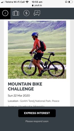
Thanks to our Ambassador, Ben Southall of Best Life Adventures, for the example Trip Page.
Need more help?
Our team is here to support you on your journey. Simply type your question in the chatbox below and one of our team members will be there to answer.